 网硕互联帮助中心
文章目录
- 基于 Flutter × OpenHarmony 的新生宿舍管理系统:快速操作模块开发解析
-
- 前言
- 背景
- Flutter × OpenHarmony 跨端开发介绍
-
- Flutter 特性
- OpenHarmony 特性
- 开发核心代码解析
-
- 分析 `_buildQuickActions` 方法
- `_buildActionButton` 方法
- 分析 `_buildActionButton` 方法
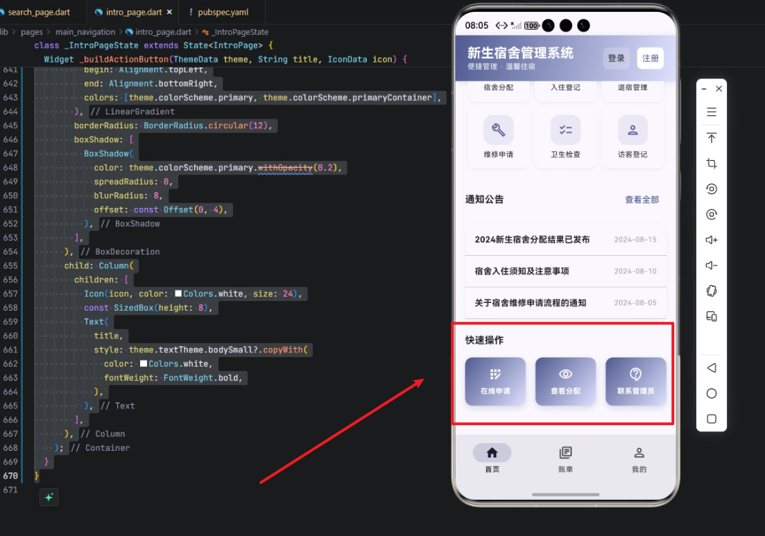
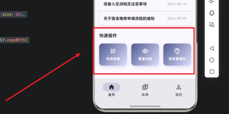
- UI 效果
- 心得
- 总结
基于 Flutter × OpenHarmony 的新生宿舍管理系统:快速操作模块开发解析
前言
在高校校园信息化建设中,新生宿舍管理是一个核心环节。传统的宿舍管理依赖人工登记与线下沟通,效率低、易出错。随着移动端应用的发展,结合 Flutter × OpenHarmony 跨端开发框架,我们可以构建一个统一的宿舍管理系统,实现“快速操作”功能,让新生能够 在线申请宿舍、查看分配情况、联系管理员,极大提升管理效率和用户体验。
本文将从技术角度,详细解析快速操作模块的实现方法,并结合 Flutter 与 OpenHarmony 的跨端特性进行说明。
背景
新生宿舍管理系统需要满足以下需求:
为了满足这些需求,我们采用 Flutter × OpenHarmony 跨端开发,同一套代码可编译到 iOS、Android 和 OpenHarmony 设备,保证系统在多端一致性与维护成本最小化。
Flutter × OpenHarmony 跨端开发介绍
Flutter 特性
- 跨平台 UI 框架:一次开发,多端运行。
- 丰富组件库:如 Widget、Row、Column 等,可快速构建 UI。
- 热重载:快速调试界面与逻辑。
OpenHarmony 特性
- 分布式能力:支持多设备协作,例如在手表或智能屏上查看宿舍状态。
- 轻量级系统:适合校园场景的低功耗设备。
- 与 Flutter 兼容:可以将 Flutter 构建的 UI 部署在 OpenHarmony 平台上,实现无缝跨端体验。
通过结合 Flutter 与 OpenHarmony,我们能够实现 跨平台、统一管理、可扩展的宿舍管理系统。
开发核心代码解析
下面是快速操作模块的完整实现代码,并附详细逐行解析。
// 快速操作模块
Widget _buildQuickActions(ThemeData theme) {
return Column(
crossAxisAlignment: CrossAxisAlignment.start,
children: [
Text(
'快速操作',
style: theme.textTheme.titleMedium?.copyWith(
fontWeight: FontWeight.bold,
),
),
const SizedBox(height: 16),
Row(
children: [
Expanded(
child: _buildActionButton(
theme, '在线申请', Icons.app_registration_outlined,
),
),
const SizedBox(width: 16),
Expanded(
child: _buildActionButton(
theme, '查看分配', Icons.visibility_outlined,
),
),
const SizedBox(width: 16),
Expanded(
child: _buildActionButton(
theme, '联系管理员', Icons.contact_support_outlined,
),
),
],
),
],
);
}
分析 _buildQuickActions 方法
Widget _buildQuickActions(ThemeData theme)
- 定义了一个返回 Widget 的方法,用于快速操作模块。
- 传入 ThemeData theme,可以动态使用主题颜色和字体风格,保证与整体界面风格一致。
Column(crossAxisAlignment: CrossAxisAlignment.start, children: […])
- 使用 Column 垂直布局所有子组件。
- crossAxisAlignment: CrossAxisAlignment.start 保证文字与按钮左对齐。
Text('快速操作', style: theme.textTheme.titleMedium?.copyWith(fontWeight: FontWeight.bold))
- 显示模块标题“快速操作”。
- 使用主题的 titleMedium 样式,并加粗。
const SizedBox(height: 16)
- 添加垂直间距,让标题和按钮行分开。
Row(children: […])
- 水平布局操作按钮。
- 每个按钮占一份空间,用 Expanded 自动撑满。
_buildActionButton(theme, '在线申请', Icons.app_registration_outlined)
- 调用自定义按钮方法 _buildActionButton。
- 传入按钮标题和图标,实现功能区分。
_buildActionButton 方法
Widget _buildActionButton(ThemeData theme, String title, IconData icon) {
return Container(
padding: const EdgeInsets.all(16),
decoration: BoxDecoration(
gradient: LinearGradient(
begin: Alignment.topLeft,
end: Alignment.bottomRight,
colors: [theme.colorScheme.primary, theme.colorScheme.primaryContainer],
),
borderRadius: BorderRadius.circular(12),
boxShadow: [
BoxShadow(
color: theme.colorScheme.primary.withOpacity(0.2),
spreadRadius: 0,
blurRadius: 8,
offset: const Offset(0, 4),
),
],
),
child: Column(
children: [
Icon(icon, color: Colors.white, size: 24),
const SizedBox(height: 8),
Text(
title,
style: theme.textTheme.bodySmall?.copyWith(
color: Colors.white,
fontWeight: FontWeight.bold,
),
),
],
),
);
}
分析 _buildActionButton 方法
Container(padding: const EdgeInsets.all(16), decoration: …)
- 外层容器设置内边距,确保内容不会紧贴边缘。
- decoration 用于添加渐变、圆角和阴影。
gradient: LinearGradient(…)
- 设置按钮渐变色,从 primary 到 primaryContainer。
- 增强视觉层次感,使按钮更具吸引力。
borderRadius: BorderRadius.circular(12)
- 圆角半径 12,保证现代化、柔和 UI 风格。
boxShadow: [BoxShadow(…)]
- 添加阴影,使按钮有浮起感。
- blurRadius: 8 模糊程度,offset: Offset(0, 4) 下方偏移。
Column(children: […])
- 按钮内部垂直布局,先图标后文字。
- Icon(icon, color: Colors.white, size: 24) 显示图标。
- SizedBox(height: 8) 图标与文字间距。
- Text(title, style: …) 显示按钮文字,使用白色加粗字体。
UI 效果
- 三个按钮等宽,横向排列。
- 支持响应式布局,在不同屏幕尺寸下均匀分布。
- 视觉风格统一,渐变+阴影增强点击感。
心得
Flutter 的灵活性
- Column、Row、Expanded 等布局组件可以快速实现复杂 UI。
- 主题化支持保证跨端一致性。
OpenHarmony 的扩展能力
- 可以在智能屏、手表端查看快速操作模块,保证校园管理无缝多端协作。
模块化设计
- _buildQuickActions 与 _buildActionButton 拆分方法,易于维护和扩展。
- 后续增加新操作按钮,只需复用 _buildActionButton 即可。
渐变与阴影增强交互感
- UI 细节对用户体验有显著提升,尤其是移动端。
总结
通过 Flutter × OpenHarmony 跨端开发,我们实现了新生宿舍管理系统中的 快速操作模块。模块支持在线申请、查看分配和联系管理员三大核心功能,并且具有良好的跨端一致性和用户体验。
技术上,利用 Flutter 的布局和主题机制,实现了高复用、高可维护的按钮组件设计;OpenHarmony 的分布式能力则提供了多端协作可能。未来可以扩展更多功能,例如自动提醒、宿舍分配预测等,让校园管理更智能、高效。
欢迎加入开源鸿蒙跨平台社区:https://openharmonycrossplatform.csdn.net


评论前必须登录!
注册