 网硕互联帮助中心
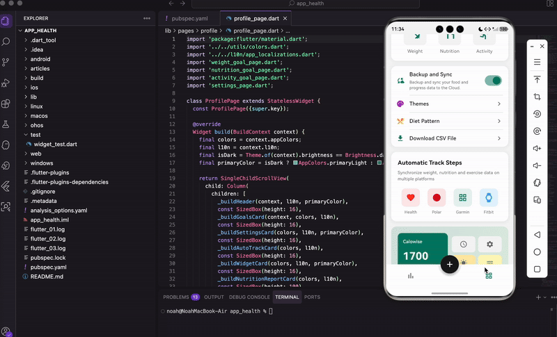
写在前面
个人中心页面是健康管理App的重要组成部分,用户可以在这里设置目标、管理数据、定制主题。和首页的数据展示不同,个人中心更侧重于功能入口和个性化设置。
我们这个页面包含了目标设置、数据同步、主题定制、自动追踪、小组件添加、营养报告等功能模块。每个模块都用卡片形式呈现,视觉上清晰分明。这篇文章会详细讲解如何构建这样一个功能丰富的个人中心页面。
导入依赖
import 'package:flutter/material.dart';
import '../../utils/colors.dart';
import '../../l10n/app_localizations.dart';
import 'weight_goal_page.dart';
import 'nutrition_goal_page.dart';
import 'activity_goal_page.dart';
import 'settings_page.dart';
导入了颜色工具类、国际化模块,以及几个子页面:体重目标、营养目标、活动目标、设置页面。
创建页面
个人中心页面不需要管理状态,用 StatelessWidget:
class ProfilePage extends StatelessWidget {
const ProfilePage({super.key});
构建主体
Widget build(BuildContext context) {
final colors = context.appColors;
final l10n = context.l10n;
final isDark = Theme.of(context).brightness == Brightness.dark;
final primaryColor = isDark ? AppColors.primaryLight : AppColors.primary;
return SingleChildScrollView(
child: Column(
children: [
_buildHeader(context, l10n, primaryColor),
const SizedBox(height: 16),
_buildGoalsCard(context, colors, l10n),
const SizedBox(height: 16),
_buildSettingsCard(colors, l10n, primaryColor),
const SizedBox(height: 16),
_buildAutoTrackCard(colors, l10n),
const SizedBox(height: 16),
_buildWidgetCard(colors, l10n, primaryColor),
const SizedBox(height: 16),
_buildNutritionReportCard(colors, l10n),
const SizedBox(height: 100),
],
),
);
}
页面由多个卡片组成,用 SingleChildScrollView 包裹让内容可以滚动。底部留100像素的空白,避免被底部导航栏遮挡。
primaryColor 根据深色模式选择不同的主题色,深色模式下用浅色版本,看起来更舒服。
顶部标题栏
Widget _buildHeader(BuildContext context, AppLocalizations l10n, Color primaryColor) {
return Container(
padding: const EdgeInsets.symmetric(horizontal: 16, vertical: 12),
decoration: BoxDecoration(color: primaryColor),
child: Row(
mainAxisAlignment: MainAxisAlignment.spaceBetween,
children: [
const Icon(Icons.search, color: Colors.white, size: 24),
Text(
l10n.betterMe,
style: const TextStyle(
color: Colors.white,
fontSize: 18,
fontWeight: FontWeight.w600,
),
),
标题栏用主题色背景,左边是搜索图标,中间是"Better Me"标题。
GestureDetector(
onTap: () {
Navigator.push(
context,
MaterialPageRoute(builder: (context) => const SettingsPage()),
);
},
child: Container(
padding: const EdgeInsets.all(6),
decoration: BoxDecoration(
color: Colors.white.withOpacity(0.2),
shape: BoxShape.circle,
),
child: const Icon(Icons.settings, color: Colors.white, size: 20),
),
),
],
),
);
}
右边是设置按钮,点击跳转到设置页面。按钮用半透明白色圆形背景,和标题栏融为一体。
目标卡片
目标卡片展示三个核心目标入口:体重、营养、活动。
Widget _buildGoalsCard(BuildContext context, AppColorsExtension colors, AppLocalizations l10n) {
return Container(
margin: const EdgeInsets.symmetric(horizontal: 16),
padding: const EdgeInsets.all(20),
decoration: BoxDecoration(
color: colors.cardBackground,
borderRadius: BorderRadius.circular(16),
boxShadow: [
BoxShadow(
color: Colors.black.withOpacity(0.05),
blurRadius: 10,
offset: const Offset(0, 2),
),
],
),
卡片有圆角和轻微阴影,看起来有层次感。
child: Column(
crossAxisAlignment: CrossAxisAlignment.start,
children: [
Text(
l10n.myGoals,
style: TextStyle(
fontSize: 20,
fontWeight: FontWeight.bold,
color: colors.textPrimary,
),
),
const SizedBox(height: 20),
顶部是"我的目标"标题。
Row(
mainAxisAlignment: MainAxisAlignment.spaceAround,
children: [
_buildGoalItem(context, l10n.weight, Icons.fitness_center, colors, onTap: () {
Navigator.push(context, MaterialPageRoute(builder: (context) => const WeightGoalPage()));
}),
_buildGoalItem(context, l10n.nutrition, Icons.restaurant, colors, onTap: () {
Navigator.push(context, MaterialPageRoute(builder: (context) => const NutritionGoalPage()));
}),
_buildGoalItem(context, l10n.activity, Icons.directions_run, colors, onTap: () {
Navigator.push(context, MaterialPageRoute(builder: (context) => const ActivityGoalPage()));
}),
],
),
],
),
);
}
三个目标项横向排列,点击分别跳转到对应的目标设置页面。
目标项组件
Widget _buildGoalItem(BuildContext context, String label, IconData icon, AppColorsExtension colors, {VoidCallback? onTap}) {
final isDark = Theme.of(context).brightness == Brightness.dark;
final primaryColor = isDark ? AppColors.primaryLight : AppColors.primary;
return GestureDetector(
onTap: onTap,
child: Column(
children: [
Container(
width: 70,
height: 70,
decoration: BoxDecoration(
color: colors.inputBackground,
borderRadius: BorderRadius.circular(12),
),
child: Icon(icon, size: 36, color: primaryColor),
),
const SizedBox(height: 8),
Text(label, style: TextStyle(fontSize: 14, color: colors.textSecondary)),
],
),
);
}
每个目标项是一个方形图标加文字标签。图标背景用 inputBackground 颜色,深色模式下会自动变深。
设置功能卡片
这个卡片包含备份同步、主题、饮食模式、下载CSV等功能入口:
Widget _buildSettingsCard(AppColorsExtension colors, AppLocalizations l10n, Color primaryColor) {
return Container(
margin: const EdgeInsets.symmetric(horizontal: 16),
decoration: BoxDecoration(
color: colors.cardBackground,
borderRadius: BorderRadius.circular(16),
boxShadow: [
BoxShadow(
color: Colors.black.withOpacity(0.05),
blurRadius: 10,
offset: const Offset(0, 2),
),
],
),
卡片样式和目标卡片一致。
child: Column(
children: [
_buildSettingItem(
icon: Icons.cloud_sync,
iconColor: primaryColor,
title: l10n.backupSync,
subtitle: l10n.backupSyncDesc,
hasSwitch: true,
switchValue: true,
colors: colors,
primaryColor: primaryColor,
),
_buildDivider(colors),
第一项是备份同步,带开关和描述文字。
_buildSettingItem(
icon: Icons.palette,
iconColor: Colors.purple,
title: l10n.themes,
hasArrow: true,
colors: colors,
primaryColor: primaryColor,
),
_buildDivider(colors),
_buildSettingItem(
icon: Icons.restaurant_menu,
iconColor: Colors.orange,
title: l10n.dietPattern,
hasArrow: true,
colors: colors,
primaryColor: primaryColor,
),
_buildDivider(colors),
_buildSettingItem(
icon: Icons.download,
iconColor: primaryColor,
title: l10n.downloadCsv,
hasArrow: true,
colors: colors,
primaryColor: primaryColor,
),
],
),
);
}
后面三项是主题、饮食模式、下载CSV,都带右箭头表示可以点击进入。
设置项组件
Widget _buildSettingItem({
required IconData icon,
required Color iconColor,
required String title,
String? subtitle,
bool hasSwitch = false,
bool switchValue = false,
bool hasArrow = false,
required AppColorsExtension colors,
required Color primaryColor,
}) {
return Padding(
padding: const EdgeInsets.symmetric(horizontal: 16, vertical: 14),
child: Row(
children: [
Icon(icon, color: iconColor, size: 24),
const SizedBox(width: 16),
左边是彩色图标,每个功能用不同颜色区分。
Expanded(
child: Column(
crossAxisAlignment: CrossAxisAlignment.start,
children: [
Text(title, style: TextStyle(fontSize: 16, fontWeight: FontWeight.w500, color: colors.textPrimary)),
if (subtitle != null) ...[
const SizedBox(height: 4),
Text(subtitle, style: TextStyle(fontSize: 12, color: colors.textSecondary)),
],
],
),
),
中间是标题和可选的副标题。
if (hasSwitch) Switch(value: switchValue, onChanged: (value) {}, activeColor: primaryColor),
if (hasArrow) Icon(Icons.chevron_right, color: colors.textSecondary),
],
),
);
}
右边根据参数显示开关或箭头。
分割线
Widget _buildDivider(AppColorsExtension colors) {
return Divider(height: 1, indent: 56, endIndent: 16, color: colors.divider);
}
分割线左边缩进56像素,避开图标区域。
自动追踪卡片
这个卡片展示支持的健康平台:
Widget _buildAutoTrackCard(AppColorsExtension colors, AppLocalizations l10n) {
return Container(
margin: const EdgeInsets.symmetric(horizontal: 16),
padding: const EdgeInsets.all(20),
decoration: BoxDecoration(
color: colors.cardBackground,
borderRadius: BorderRadius.circular(16),
boxShadow: [
BoxShadow(
color: Colors.black.withOpacity(0.05),
blurRadius: 10,
offset: const Offset(0, 2),
),
],
),
child: Column(
crossAxisAlignment: CrossAxisAlignment.start,
children: [
Text(l10n.autoTrackSteps, style: TextStyle(fontSize: 18, fontWeight: FontWeight.bold, color: colors.textPrimary)),
const SizedBox(height: 8),
Text(l10n.autoTrackDesc, style: TextStyle(fontSize: 13, color: colors.textSecondary)),
const SizedBox(height: 20),
顶部是标题和描述文字。
Row(
mainAxisAlignment: MainAxisAlignment.spaceAround,
children: [
_buildPlatformItem(Icons.favorite, Colors.red, 'Health', colors),
_buildPlatformItem(Icons.circle, Colors.red.shade800, 'Polar', colors),
_buildPlatformItem(Icons.grid_view, AppColors.primary, 'Garmin', colors),
_buildPlatformItem(Icons.watch, Colors.blue, 'Fitbit', colors),
],
),
],
),
);
}
四个平台图标横向排列:Apple Health、Polar、Garmin、Fitbit。
平台项组件
Widget _buildPlatformItem(IconData icon, Color color, String label, AppColorsExtension colors) {
return Column(
children: [
Container(
width: 56,
height: 56,
decoration: BoxDecoration(
color: color.withOpacity(0.1),
borderRadius: BorderRadius.circular(12),
),
child: Icon(icon, color: color, size: 28),
),
const SizedBox(height: 8),
Text(label, style: TextStyle(fontSize: 12, color: colors.textSecondary)),
],
);
}
每个平台用对应的品牌色,图标背景是品牌色的透明版本。
小组件卡片
这个卡片展示可以添加到主屏幕的小组件预览:
Widget _buildWidgetCard(AppColorsExtension colors, AppLocalizations l10n, Color primaryColor) {
return Container(
margin: const EdgeInsets.symmetric(horizontal: 16),
padding: const EdgeInsets.all(20),
decoration: BoxDecoration(
gradient: LinearGradient(
colors: [primaryColor.withOpacity(0.15), Colors.green.withOpacity(0.1)],
begin: Alignment.topLeft,
end: Alignment.bottomRight,
),
borderRadius: BorderRadius.circular(16),
),
这个卡片用渐变背景,从主题色到绿色,看起来更活泼。
child: Column(
children: [
Row(
children: [
Expanded(
child: Container(
padding: const EdgeInsets.all(16),
decoration: BoxDecoration(
color: primaryColor,
borderRadius: BorderRadius.circular(12),
),
child: Column(
crossAxisAlignment: CrossAxisAlignment.start,
children: [
const Text('Calowise', style: TextStyle(color: Colors.white, fontSize: 14, fontWeight: FontWeight.w500)),
const SizedBox(height: 12),
const Text('1700', style: TextStyle(color: Colors.white, fontSize: 32, fontWeight: FontWeight.bold)),
Text(l10n.remaining, style: const TextStyle(color: Colors.white70, fontSize: 12)),
],
),
),
),
左边是主小组件预览,显示剩余卡路里。
const SizedBox(width: 12),
Expanded(
child: Column(
children: [
Row(
children: [
_buildMiniWidget(Icons.access_time, colors.inputBackground),
const SizedBox(width: 8),
_buildMiniWidget(Icons.settings, colors.inputBackground),
],
),
const SizedBox(height: 8),
Row(
children: [
_buildMiniWidget(Icons.wb_sunny, Colors.amber.shade100),
const SizedBox(width: 8),
_buildMiniWidget(Icons.notes, Colors.yellow.shade100),
],
),
],
),
),
],
),
右边是四个小型组件预览,2×2排列。
const SizedBox(height: 16),
TextButton.icon(
onPressed: () {},
icon: Icon(Icons.add, color: primaryColor),
label: Text(l10n.addWidgetToHome, style: TextStyle(color: primaryColor, fontWeight: FontWeight.w600)),
),
],
),
);
}
底部是添加按钮。
迷你组件
Widget _buildMiniWidget(IconData icon, Color bgColor) {
return Expanded(
child: Container(
height: 50,
decoration: BoxDecoration(color: bgColor, borderRadius: BorderRadius.circular(10)),
child: Icon(icon, color: Colors.grey.shade600, size: 24),
),
);
}
迷你组件就是一个带图标的小方块。
营养报告卡片
最后一个卡片是每周营养报告入口:
Widget _buildNutritionReportCard(AppColorsExtension colors, AppLocalizations l10n) {
return Container(
margin: const EdgeInsets.symmetric(horizontal: 16),
padding: const EdgeInsets.all(20),
decoration: BoxDecoration(
gradient: LinearGradient(
colors: [Colors.green.shade50, Colors.teal.shade50],
begin: Alignment.topLeft,
end: Alignment.bottomRight,
),
borderRadius: BorderRadius.circular(16),
),
用绿色系渐变背景,和健康主题呼应。
child: Row(
children: [
Expanded(
child: Column(
crossAxisAlignment: CrossAxisAlignment.start,
children: [
Container(
padding: const EdgeInsets.symmetric(horizontal: 8, vertical: 4),
decoration: BoxDecoration(color: Colors.red, borderRadius: BorderRadius.circular(4)),
child: const Text('NEW', style: TextStyle(color: Colors.white, fontSize: 10, fontWeight: FontWeight.bold)),
),
const SizedBox(height: 12),
Text(l10n.weeklyNutritionReport, style: TextStyle(fontSize: 18, fontWeight: FontWeight.bold, color: colors.textPrimary)),
],
),
),
左边是NEW标签和标题。
Container(
width: 100,
height: 80,
decoration: BoxDecoration(
color: Colors.white.withOpacity(0.5),
borderRadius: BorderRadius.circular(12),
),
child: const Icon(Icons.analytics, size: 40, color: AppColors.primary),
),
],
),
);
}
}
右边是一个图表图标,暗示这是数据分析功能。
深色模式适配
个人中心页面的深色模式适配主要体现在:
第一,主题色根据模式切换:
final isDark = Theme.of(context).brightness == Brightness.dark;
final primaryColor = isDark ? AppColors.primaryLight : AppColors.primary;
第二,卡片背景使用 colors.cardBackground:
color: colors.cardBackground,
第三,文字颜色使用 colors.textPrimary 和 colors.textSecondary:
style: TextStyle(fontSize: 20, fontWeight: FontWeight.bold, color: colors.textPrimary),
第四,输入框背景使用 colors.inputBackground:
color: colors.inputBackground,
第五,分割线使用 colors.divider:
color: colors.divider,
渐变背景的使用
个人中心页面用了两处渐变背景,让页面更有层次感:
小组件卡片的渐变:
gradient: LinearGradient(
colors: [primaryColor.withOpacity(0.15), Colors.green.withOpacity(0.1)],
begin: Alignment.topLeft,
end: Alignment.bottomRight,
),
从左上到右下,主题色渐变到绿色。
营养报告卡片的渐变:
gradient: LinearGradient(
colors: [Colors.green.shade50, Colors.teal.shade50],
begin: Alignment.topLeft,
end: Alignment.bottomRight,
),
从浅绿到浅青,都是健康相关的颜色。
渐变背景比纯色背景更有设计感,但要注意颜色不能太鲜艳,否则会喧宾夺主。
小结
这篇文章我们实现了个人中心页面,包含了目标设置、功能入口、平台集成、小组件预览、营养报告等模块。
页面采用卡片式布局,每个功能模块独立成卡,视觉上清晰分明。渐变背景和阴影效果让页面更有层次感。
深色模式适配通过 context.appColors 统一处理,代码简洁易维护。
欢迎加入开源鸿蒙跨平台社区:https://openharmonycrossplatform.csdn.net


评论前必须登录!
注册