 网硕互联帮助中心
带数值动画的圆形仪表盘控件
- 核心实现详解
-
- 弧形角度设计
- 双层弧线绘制
- 数值动画(ValueAnimator)
- 进度比例计算
- 径向渐变扇形
- 文字绘制与自适应缩放
- 正方形测量
- 使用方法
-
- XML 布局
- 代码动态控制
- 实时数据更新
- 多仪表盘组合
- 自定义属性
- 踩坑记录
-
- drawArc 的 useCenter 参数
- RadialGradient 不清除导致后续绘制异常
- 快速连续 setValue 导致动画跳跃
- 完整代码
核心实现详解
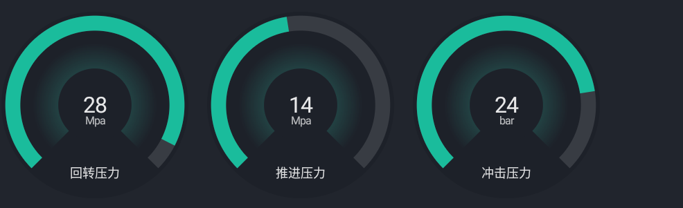
弧形角度设计
这是整个控件的基础——如何画出 270° 的弧形开口朝下的仪表盘。
val startAngle = 135f // 起始角度(左下角)
val sweepAngle = 270f // 扫过角度(3/4 圆)
角度示意图(Android Canvas 角度系,0° = 正右方,顺时针增大):
0°
──→
315° │ 45°
╱ │ ╲
270°← │ →90°
╲ │ ╱
225° │ 135°
──→
180°
实际使用范围:
135° ──→ 180° ──→ 270° ──→ 360°/0° ──→ 45°
(左下) (正左) (正上) (正右) (右下)
sweepAngle = 270°
双层弧线绘制
轨道(底色)和进度(前景色)共用同一个 RectF,只是 sweepAngle 不同:
val arcRect = RectF(
centerX – outerRadius,
centerY – outerRadius,
centerX + outerRadius,
centerX + outerRadius
)
// 1. 轨道弧(灰色底,直角端)
arcPaint.strokeCap = Paint.Cap.BUTT // 轨道用直角
arcPaint.color = trackColor
arcPaint.strokeWidth = stroke // 线宽 = 控件尺寸 * 8%
canvas.drawArc(arcRect, startAngle, sweepAngle, false, arcPaint)
// 2. 进度弧(绿色,圆角端)
arcPaint.color = progressColor
// 注意:这里没改 strokeCap,进度弧也用 BUTT
// 如果想要圆角进度头,可以在画进度前设置:
// arcPaint.strokeCap = Paint.Cap.ROUND
canvas.drawArc(arcRect, startAngle, sweepAngle * ratio, false, arcPaint)
关键参数:
| strokeWidth | size * 0.08f | 弧线粗细,随控件大小自适应 |
| useCenter | false | 不连接圆心,只画弧线 |
| ratio | (value – min) / (max – min) | 进度比例,范围 [0, 1] |
Paint.Cap 选择:轨道用 BUTT(平头),进度也用 BUTT。如果进度想要圆头,改成 ROUND,但要注意圆头会在弧线两端各延伸 strokeWidth/2,可能超出轨道范围。
数值动画(ValueAnimator)
数值变化时不是"瞬变",而是平滑过渡:
var value: Int = 0
set(newValue) {
val clampedValue = newValue.coerceIn(minValue, maxValue)
if (field != clampedValue) {
animateToValue(clampedValue.toFloat())
field = clampedValue
}
}
private var animatedValue: Float = 0f // 动画当前值
private var valueAnimator: ValueAnimator? = null
var animationDuration: Long = 1000L // 动画时长,默认 1 秒
private fun animateToValue(targetValue: Float) {
valueAnimator?.cancel() // 先取消旧动画
val animator = ValueAnimator.ofFloat(animatedValue, targetValue)
animator.duration = animationDuration
animator.interpolator = LinearInterpolator() // 线性插值,匀速变化
animator.addUpdateListener { animation ->
animatedValue = animation.animatedValue as Float
invalidate() // 每帧重绘
}
animator.start()
valueAnimator = animator
}
进度比例计算
val ratio = if (maxValue == minValue) {
0f // 防止除以 0
} else {
((animatedValue – minValue) / (maxValue – minValue)).coerceIn(0f, 1f)
}
注意三个边界:
| maxValue == minValue | ratio = 0f,避免除零异常 |
| animatedValue < minValue | coerceIn(0f, 1f) 钳制到 0 |
| animatedValue > maxValue | coerceIn(0f, 1f) 钳制到 1 |
径向渐变扇形
中心区域有一个从内到外渐变的扇形效果,使用 RadialGradient:
// 中心背景圆
val centerRadius = outerRadius * 0.72f
centerPaint.color = centerColor
canvas.drawCircle(centerX, centerY, centerRadius, centerPaint)
// 扇形渐变(跟随进度弧的扇形区域)
val gradientRadius = centerRadius * 1.05f
val sectorRect = RectF(
centerX – gradientRadius,
centerY – gradientRadius,
centerX + gradientRadius,
centerY + gradientRadius
)
sectorPaint.shader = RadialGradient(
centerX, centerY, gradientRadius,
Color.parseColor("#8034BAA2"), // 中心:半透明青绿
Color.parseColor("#00EEF1F4"), // 边缘:全透明浅灰
Shader.TileMode.CLAMP
)
canvas.drawArc(sectorRect, startAngle, sweepAngle, true, sectorPaint)
// 注意 useCenter = true,扇形会连接圆心
sectorPaint.shader = null // 用完清除,避免影响后续绘制
RadialGradient 参数:
RadialGradient(
centerX, // 圆心 X
centerY, // 圆心 Y
gradientRadius, // 渐变半径
startColor, // 中心颜色(#8034BAA2 = 50% 透明青绿)
endColor, // 边缘颜色(#00EEF1F4 = 全透明)
TileMode.CLAMP // 超出半径后用边缘色填充
)
文字绘制与自适应缩放
三段文字:数值、单位、标题,各有独立的颜色和字号:
// 数值文字
textPaint.color = valueColor
textPaint.textSize = if (valueTextSizePx > 0) valueTextSizePx else size * 0.17f
val valueText = if (ratio.isNaN()) {
"–" // 异常情况显示占位符
} else {
String.format(Locale.US, "%.${decimalPlaces}f", animatedValue) // 支持小数
}
canvas.drawText(valueText, centerX, centerY + textPaint.textSize / 3f, textPaint)
// 单位文字(数值下方)
textPaint.color = unitColor
textPaint.textSize = if (unitTextSizePx > 0) unitTextSizePx else size * 0.085f
textPaint.alpha = 180 // 半透明,弱化单位
canvas.drawText(unit, centerX, centerY + textPaint.textSize * 1.8f, textPaint)
// 标题文字(底部)
textPaint.color = titleColor
textPaint.textSize = if (titleTextSizePx > 0) titleTextSizePx else size * 0.1f
textPaint.alpha = 220
val titleOffset = 20f * resources.displayMetrics.density
canvas.drawText(title, centerX, h – titleOffset, textPaint)
自适应逻辑:
textSize = if (valueTextSizePx > 0) {
valueTextSizePx // 用户指定了固定值 → 用固定值
} else {
size * 0.17f // 未指定 → 按控件尺寸的百分比自动缩放
}
| 数值 | size * 0.17f | 最大,主角 |
| 单位 | size * 0.085f | 约为数值的一半 |
| 标题 | size * 0.1f | 略大于单位 |
文字 Y 坐标计算:
- 数值:centerY + textSize / 3f — 近似垂直居中(baseline 偏移补偿)
- 单位:centerY + textSize * 1.8f — 在数值下方
- 标题:h – 20dp — 距离控件底部 20dp
小数格式化:
String.format(Locale.US, "%.${decimalPlaces}f", animatedValue)
正方形测量
override fun onMeasure(widthMeasureSpec: Int, heightMeasureSpec: Int) {
val minSize = (160 * resources.displayMetrics.density).toInt() // 最小 160dp
val width = resolveSize(minSize, widthMeasureSpec)
val height = resolveSize(minSize, heightMeasureSpec)
val size = min(width, height) // 取宽高的较小值,保持正方形
setMeasuredDimension(size, size)
}
设计意图:
- 仪表盘必须是正方形,否则弧线会变成椭圆
- 最小尺寸 160dp,太小了文字会挤在一起
- resolveSize 会根据 MeasureSpec 模式(EXACTLY / AT_MOST / UNSPECIFIED)和最小值算出最终尺寸
使用方法
XML 布局
<com.demo.rigremote.widgets.GaugeView
android:id="@+id/gaugeView"
android:layout_width="200dp"
android:layout_height="200dp"
app:gv_minValue="0"
app:gv_maxValue="100"
app:gv_value="0"
app:gv_unit="rpm"
app:gv_title="转速"
app:gv_progressColor="#1ABC9C"
app:gv_trackColor="#EDEFF2"
app:gv_centerColor="#FFFFFF"
app:gv_bgColor="#FFFFFF"
app:gv_textColor="#252931"
app:gv_valueTextSize="34sp"
app:gv_unitTextSize="14sp"
app:gv_titleTextSize="18sp" />
代码动态控制
val gauge = findViewById<GaugeView>(R.id.gaugeView)
// 基本设置
gauge.minValue = 0
gauge.maxValue = 1500
gauge.value = 750 // 会触发动画,从当前值平滑过渡到 750
gauge.unit = "rpm"
gauge.title = "动力头转速"
// 小数位数
gauge.decimalPlaces = 1 // 显示 "750.0"
// 动画时长
gauge.animationDuration = 800L // 800ms 过渡
// 颜色定制
gauge.progressColor = Color.parseColor("#FF6B00")
gauge.trackColor = Color.parseColor("#F0F0F0")
gauge.valueColor = Color.parseColor("#252931")
gauge.titleColor = Color.parseColor("#888B91")
// 文字大小(不设置则自适应)
gauge.valueTextSizePx = 36f.spToPx()
gauge.unitTextSizePx = 14f.spToPx()
gauge.titleTextSizePx = 18f.spToPx()
实时数据更新
// 模拟传感器数据每秒更新
val handler = Handler(Looper.getMainLooper())
var currentValue = 0
val updateRunnable = object : Runnable {
override fun run() {
currentValue = readSensorData() // 读取传感器数据
gauge.value = currentValue // 自动触发动画过渡
handler.postDelayed(this, 1000)
}
}
handler.post(updateRunnable)
多仪表盘组合
<!– 横向排列多个仪表盘 –>
<LinearLayout
android:layout_width="match_parent"
android:layout_height="wrap_content"
android:orientation="horizontal"
android:gravity="center">
<com.demo.rigremote.widgets.GaugeView
android:layout_width="0dp"
android:layout_height="160dp"
android:layout_weight="1"
app:gv_title="转速"
app:gv_unit="rpm"
app:gv_maxValue="1500"
app:gv_progressColor="#1ABC9C" />
<com.demo.rigremote.widgets.GaugeView
android:layout_width="0dp"
android:layout_height="160dp"
android:layout_weight="1"
app:gv_title="扭矩"
app:gv_unit="N·m"
app:gv_maxValue="500"
app:gv_progressColor="#3498DB" />
<com.demo.rigremote.widgets.GaugeView
android:layout_width="0dp"
android:layout_height="160dp"
android:layout_weight="1"
app:gv_title="压力"
app:gv_unit="MPa"
app:gv_maxValue="35"
app:gv_progressColor="#E74C3C" />
</LinearLayout>
自定义属性
在 res/values/attrs.xml 中定义:
<declare-styleable name="GaugeView">
<attr name="gv_minValue" format="integer" />
<attr name="gv_maxValue" format="integer" />
<attr name="gv_value" format="integer" />
<attr name="gv_unit" format="string" />
<attr name="gv_title" format="string" />
<attr name="gv_progressColor" format="color" />
<attr name="gv_trackColor" format="color" />
<attr name="gv_centerColor" format="color" />
<attr name="gv_bgColor" format="color" />
<attr name="gv_textColor" format="color" />
<attr name="gv_titleColor" format="color" />
<attr name="gv_unitColor" format="color" />
<attr name="gv_valueColor" format="color" />
<attr name="gv_valueTextSize" format="dimension" />
<attr name="gv_unitTextSize" format="dimension" />
<attr name="gv_titleTextSize" format="dimension" />
</declare-styleable>
踩坑记录
drawArc 的 useCenter 参数
问题:画扇形渐变时,useCenter = false 导致只画了一段弧线,没有填充扇形区域。
解决:drawArc(rect, startAngle, sweepAngle, useCenter, paint) 的第四个参数:
| true | 扇形(弧线 + 两条半径 + 填充) |
| false | 只有弧线(配合 STROKE 风格使用) |
扇形渐变区域要用 useCenter = true,进度弧线要用 useCenter = false。
RadialGradient 不清除导致后续绘制异常
问题:画完扇形渐变后,用同一个 sectorPaint 画其他图形时颜色不对。
解决:用完 shader 后立即置空:
sectorPaint.shader = RadialGradient(...)
canvas.drawArc(sectorRect, startAngle, sweepAngle, true, sectorPaint)
sectorPaint.shader = null // 关键:用完清除
快速连续 setValue 导致动画跳跃
问题:快速连续调用 setValue(50) → setValue(80) → setValue(30),可能出现数值跳跃。
解决:每次 animateToValue 前先 cancel 旧动画,且新动画的起始值用 animatedValue(当前动画帧的值)而不是 field(目标值):
private fun animateToValue(targetValue: Float) {
valueAnimator?.cancel() // 取消旧动画
// 从 animatedValue(当前实际显示值)开始,不是从 field(上次目标值)
val animator = ValueAnimator.ofFloat(animatedValue, targetValue)
// …
}
这样即使连续调用,动画始终从当前可见值平滑过渡,不会跳跃。
完整代码
package com.demo.rigremote.widgets
import android.animation.ValueAnimator
import android.content.Context
import android.graphics.*
import android.util.AttributeSet
import android.util.TypedValue
import android.view.View
import android.view.animation.LinearInterpolator
import androidx.core.content.ContextCompat
import com.demo.rigremote.R
import java.util.Locale
import kotlin.math.min
/**
* 简易仪表盘 View:
* – 支持最小值、最大值、当前值
* – 支持单位、标题
* – 进度弧自动根据当前值计算
*/
class GaugeView @JvmOverloads constructor(
context: Context,
attrs: AttributeSet? = null,
defStyleAttr: Int = 0
) : View(context, attrs, defStyleAttr) {
// 可配置属性
var minValue: Int = 0
set(value) {
field = value
invalidate()
}
var maxValue: Int = 100
set(value) {
field = value
invalidate()
}
var value: Int = 0
set(newValue) {
val clampedValue = newValue.coerceIn(minValue, maxValue)
if (field != clampedValue) {
animateToValue(clampedValue.toFloat())
field = clampedValue
}
}
// 小数位数(0表示显示整数,1表示显示1位小数,以此类推)
var decimalPlaces: Int = 0
set(value) {
field = value.coerceAtLeast(0).coerceAtMost(4)
invalidate()
}
// 动画显示的当前值
private var animatedValue: Float = 0f
// 动画相关
private var valueAnimator: ValueAnimator? = null
var animationDuration: Long = 1000L // 默认动画时长1秒
var unit: String = ""
set(value) {
field = value
invalidate()
}
var title: String = ""
set(value) {
field = value
invalidate()
}
var progressColor: Int = Color.parseColor("#1ABC9C")
var trackColor: Int = Color.parseColor("#EDEFF2")
var centerColor: Int = Color.parseColor("#FFFFFF")
var bgColor: Int = Color.parseColor("#FFFFFF")
var textColor: Int =
ContextCompat.getColor(context, com.demo.myconn.R.color.font_252931_e5ffffff)
set(value) {
field = value
invalidate()
}
var titleColor: Int = textColor
set(value) {
field = value
invalidate()
}
var unitColor: Int = textColor
set(value) {
field = value
invalidate()
}
var valueColor: Int = textColor
set(value) {
field = value
invalidate()
}
// 文本尺寸(px,可动态设置;<=0 时按控件尺寸自适应)
var valueTextSizePx: Float = –1f
set(value) {
field = value
invalidate()
}
var unitTextSizePx: Float = –1f
set(value) {
field = value
invalidate()
}
var titleTextSizePx: Float = –1f
set(value) {
field = value
invalidate()
}
// 画笔
private val arcPaint = Paint(Paint.ANTI_ALIAS_FLAG).apply {
style = Paint.Style.STROKE
strokeCap = Paint.Cap.ROUND
}
private val centerPaint = Paint(Paint.ANTI_ALIAS_FLAG).apply {
style = Paint.Style.FILL
}
private val textPaint = Paint(Paint.ANTI_ALIAS_FLAG).apply {
textAlign = Paint.Align.CENTER
}
private val sectorPaint = Paint(Paint.ANTI_ALIAS_FLAG).apply {
style = Paint.Style.FILL
}
private val textBgPaint = Paint(Paint.ANTI_ALIAS_FLAG).apply {
style = Paint.Style.FILL
color = Color.parseColor("#F7F8FA")
}
init {
animatedValue = value.toFloat()
context.theme.obtainStyledAttributes(
attrs,
R.styleable.GaugeView,
defStyleAttr,
0
).apply {
try {
minValue = getIntCompat(R.styleable.GaugeView_gv_minValue, minValue)
maxValue = getIntCompat(R.styleable.GaugeView_gv_maxValue, maxValue)
val initialValue = getIntCompat(R.styleable.GaugeView_gv_value, value)
value = initialValue
animatedValue = initialValue.toFloat()
unit = getString(R.styleable.GaugeView_gv_unit) ?: unit
title = getString(R.styleable.GaugeView_gv_title) ?: title
progressColor = getColor(
R.styleable.GaugeView_gv_progressColor,
progressColor
)
trackColor = getColor(
R.styleable.GaugeView_gv_trackColor,
trackColor
)
centerColor = getColor(
R.styleable.GaugeView_gv_centerColor,
centerColor
)
bgColor = getColor(
R.styleable.GaugeView_gv_bgColor,
bgColor
)
textColor = getColor(
R.styleable.GaugeView_gv_textColor,
ContextCompat.getColor(context, android.R.color.white)
)
titleColor = getColor(
R.styleable.GaugeView_gv_titleColor,
textColor
)
unitColor = getColor(
R.styleable.GaugeView_gv_unitColor,
textColor
)
valueColor = getColor(
R.styleable.GaugeView_gv_valueColor,
textColor
)
valueTextSizePx =
getDimension(R.styleable.GaugeView_gv_valueTextSize, valueTextSizePx)
unitTextSizePx =
getDimension(R.styleable.GaugeView_gv_unitTextSize, unitTextSizePx)
titleTextSizePx =
getDimension(R.styleable.GaugeView_gv_titleTextSize, titleTextSizePx)
} finally {
recycle()
}
}
}
/**
* 兼容读取整型属性,避免 XML 中传入 "0.0"/".0" 时 getInt 崩溃。
*/
private fun android.content.res.TypedArray.getIntCompat(index: Int, defaultValue: Int): Int {
val value = peekValue(index) ?: return defaultValue
return when (value.type) {
TypedValue.TYPE_INT_DEC,
TypedValue.TYPE_INT_HEX,
TypedValue.TYPE_INT_BOOLEAN -> getInt(index, defaultValue)
TypedValue.TYPE_FLOAT -> value.float.toInt()
TypedValue.TYPE_STRING -> value.string?.toString()?.toFloatOrNull()?.toInt() ?: defaultValue
else -> defaultValue
}
}
/**
* 动画到目标值
*/
private fun animateToValue(targetValue: Float) {
valueAnimator?.cancel()
val animator = ValueAnimator.ofFloat(animatedValue, targetValue)
animator.duration = animationDuration
animator.interpolator = LinearInterpolator()
animator.addUpdateListener { animation ->
animatedValue = animation.animatedValue as Float
invalidate()
}
animator.start()
valueAnimator = animator
}
override fun onMeasure(widthMeasureSpec: Int, heightMeasureSpec: Int) {
// 保持正方形,最小尺寸 160dp
val minSize = (160 * resources.displayMetrics.density).toInt()
val width = resolveSize(minSize, widthMeasureSpec)
val height = resolveSize(minSize, heightMeasureSpec)
val size = min(width, height)
setMeasuredDimension(size, size)
}
override fun onDraw(canvas: Canvas) {
super.onDraw(canvas)
val w = width.toFloat()
val h = height.toFloat()
val size = min(w, h)
val centerX = w / 2f
val centerY = h / 2f
val density = resources.displayMetrics.density
val stroke = size * 0.08f
// 最外层大圆底色(覆盖背景以保持圆形边界)
val baseRadius = size * 0.45f
val inset = 2f * density
val outerRadius = (baseRadius – inset).coerceAtLeast(0f)
// 外层圆要比轨道和进度的外边缘(outerRadius + stroke/2)大一点
// 但不能超出View边界,最大半径为 size/2
val outerBgRadius = (outerRadius + stroke / 2f + 5f * density).coerceAtMost(size / 2f)
textBgPaint.color = bgColor
canvas.drawCircle(centerX, centerY, outerBgRadius, textBgPaint)
val startAngle = 135f
val sweepAngle = 270f
// 轨道(直角端)
arcPaint.strokeCap = Paint.Cap.BUTT
arcPaint.color = trackColor
arcPaint.strokeWidth = stroke
val arcRect = RectF(
centerX – outerRadius,
centerY – outerRadius,
centerX + outerRadius,
centerY + outerRadius
)
canvas.drawArc(arcRect, startAngle, sweepAngle, false, arcPaint)
// 进度(使用动画值)
val ratio =
if (maxValue == minValue) 0f else ((animatedValue – minValue) / (maxValue – minValue)).coerceIn(
0f,
1f
)
arcPaint.color = progressColor
canvas.drawArc(arcRect, startAngle, sweepAngle * ratio, false, arcPaint)
// 中心背景(先底色,再渐变)
val centerRadius = outerRadius * 0.72f
centerPaint.shader = null
centerPaint.color = centerColor
canvas.drawCircle(centerX, centerY, centerRadius, centerPaint)
// 扇形渐变(跟随进度,使用径向渐变色)
val gradientRadius = centerRadius * 1.05f
val sectorRect = RectF(
centerX – gradientRadius,
centerY – gradientRadius,
centerX + gradientRadius,
centerY + gradientRadius
)
sectorPaint.shader = RadialGradient(
centerX,
centerY,
gradientRadius,
Color.parseColor("#8034BAA2"),
Color.parseColor("#00EEF1F4"),
Shader.TileMode.CLAMP
)
canvas.drawArc(sectorRect, startAngle, sweepAngle, true, sectorPaint)
sectorPaint.shader = null
// 文本:数值与单位
// 数值+单位的背景圆
val textBgRadius = centerRadius * 0.62f
canvas.drawCircle(centerX, centerY, textBgRadius, textBgPaint)
textPaint.color = valueColor
textPaint.textSize = if (valueTextSizePx > 0) valueTextSizePx else size * 0.17f
val valueText = if (ratio.isNaN()) {
"–"
} else {
String.format(Locale.US, "%.${decimalPlaces}f", animatedValue)
}
canvas.drawText(valueText, centerX, centerY + textPaint.textSize / 3f, textPaint)
textPaint.color = unitColor
textPaint.textSize = if (unitTextSizePx > 0) unitTextSizePx else size * 0.085f
textPaint.alpha = 180
canvas.drawText(unit, centerX, centerY + textPaint.textSize * 1.8f, textPaint)
// 标题(底部)
textPaint.color = titleColor
textPaint.textSize = if (titleTextSizePx > 0) titleTextSizePx else size * 0.1f
textPaint.alpha = 220
val titleOffset = 20f * resources.displayMetrics.density
canvas.drawText(title, centerX, h – titleOffset, textPaint)
}
override fun onDetachedFromWindow() {
super.onDetachedFromWindow()
valueAnimator?.cancel()
valueAnimator = null
}
}


评论前必须登录!
注册