 网硕互联帮助中心
欢迎来到pyecharts折线图系列的第四篇文章!在前三篇中,我们已经掌握了多种折线图类型,包括基本折线图、平滑折线图、雨量流量关系图、多X轴折线图、堆叠区域图和阶梯图等。在本文中,我们将继续探索五种更高级的折线图类型,帮助您进一步提升数据可视化技能。pyecahts源码
目录
-
- 图表1:渐变背景折线图——炫酷视觉效果的实现
-
- 代码解释:
- 应用场景:
- 注意事项:
- 图表2:平滑折线图——数据趋势的流畅展示
-
- 代码解释:
- 应用场景:
- 注意事项:
- 图表3:自定义标记点折线图——突出显示关键数据
-
- 代码解释:
- 应用场景:
- 注意事项:
- 图表4:分段颜色折线图与峰值标记——用电量分布分析
-
- 代码解释:
- 应用场景:
- 注意事项:
- 图表5:高级渐变背景折线图与Grid布局——专业数据展示
-
- 代码解释:
- 应用场景:
- 注意事项:
- 总结
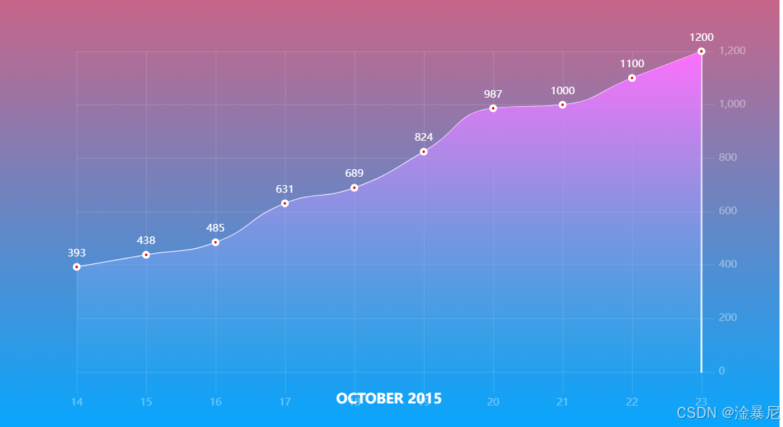
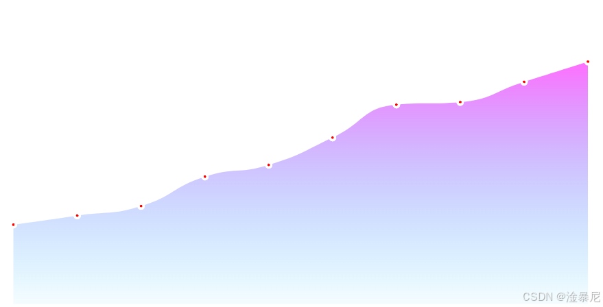
图表1:渐变背景折线图——炫酷视觉效果的实现
渐变背景折线图通过设置渐变色背景和区域填充,使图表具有更炫酷的视觉效果。这种图表特别适合用于演示和汇报,能够吸引观众的注意力,同时清晰地展示数据趋势。
import pyecharts.options as opts
from pyecharts.charts import Line
from pyecharts.commons.utils import JsCode
x_data = ["14", "15", "16", "17", "18", "19", "20", "21", "22", "23"]
y_data = [393, 438, 485, 631, 689, 824, 987, 1000, 1100, 1200]
# 定义背景渐变色
background_color_js = (
"new echarts.graphic.LinearGradient(0, 0, 0, 1, "
"[{offset: 0, color: '#c86589'}, {offset: 1, color: '#06a7ff'}], false)"
)
# 定义区域填充渐变色
area_color_js = (
"new echarts.graphic.LinearGradient(0, 0, 0, 1, "
"[{offset: 0, color: '#eb64fb'}, {offset: 1, color: '#3fbbff0d'}], false)"
)
c = (
# 初始化图表,并设置背景渐变色
Line(init_opts=opts.InitOpts(bg_color=JsCode(background_color_js)))
.add_xaxis(xaxis_data=x_data)
.add_yaxis(
series_name="注册总量",
y_axis=y_data,
is_smooth=True, # 平滑折线
is_symbol_show=True, # 显示标记点
symbol="circle", # 标记点形状为圆形
symbol_size=6, # 标记点大小
linestyle_opts=opts.LineStyleOpts(color="#fff"), # 线条颜色为白色
label_opts=opts.LabelOpts(is_show=True, position="top", color="white"), # 显示标签,位于顶部,白色
itemstyle_opts=opts.ItemStyleOpts(
color="red", border_color="#fff", border_width=3 # 标记点颜色为红色,边框白色,宽度3
),
tooltip_opts=opts.TooltipOpts(is_show=False), # 不显示提示框
areastyle_opts=opts.AreaStyleOpts(color=JsCode(area_color_js), opacity=1), # 区域填充渐变
)
.set_global_opts(
title_opts=opts.TitleOpts(
title="OCTOBER 2015",
pos_bottom="5%",
pos_left="center",
title_textstyle_opts=opts.TextStyleOpts(color="#fff", font_size=16),
),
xaxis_opts=opts.AxisOpts(
type_="category",
boundary_gap=False,
axislabel_opts=opts.LabelOpts(margin=30, color="#ffffff63"), # 坐标轴标签颜色和边距
axisline_opts=opts.AxisLineOpts(is_show=False), # 不显示坐标轴线
axistick_opts=opts.AxisTickOpts(
is_show=True,
length=25,
linestyle_opts=opts.LineStyleOpts(color="#ffffff1f"), # 刻度线颜色
),
splitline_opts=opts.SplitLineOpts(
is_show=True, linestyle_opts=opts.LineStyleOpts(color="#ffffff1f") # 分割线颜色
),
),
yaxis_opts=opts.AxisOpts(
type_="value",
position="right", # Y轴位于右侧
axislabel_opts=opts.LabelOpts(margin=20, color="#ffffff63"),
axisline_opts=opts.AxisLineOpts(
linestyle_opts=opts.LineStyleOpts(width=2, color="#fff") # Y轴线颜色和宽度
),
axistick_opts=opts.AxisTickOpts(
is_show=True,
length=15,
linestyle_opts=opts.LineStyleOpts(color="#ffffff1f"),
),
splitline_opts=opts.SplitLineOpts(
is_show=True, linestyle_opts=opts.LineStyleOpts(color="#ffffff1f")
),
),
legend_opts=opts.LegendOpts(is_show=False), # 不显示图例
)
#.render("line_color_with_js_func.html")
)
c.render_notebook()
代码解释:
- JsCode 用于在Python代码中嵌入JavaScript函数,这里用于定义渐变色
- background_color_js 和 area_color_js 分别定义了图表背景和区域填充的渐变色
- is_smooth=True 设置折线为平滑曲线
- symbol 和 symbol_size 控制标记点的形状和大小
- itemstyle_opts 设置标记点的颜色、边框颜色和宽度
- areastyle_opts 设置区域填充样式,这里使用了渐变色
- xaxis_opts 和 yaxis_opts 详细配置了坐标轴的样式,包括标签、刻度线和分割线
- title_opts 设置标题的位置、颜色和大小
应用场景:
渐变背景折线图特别适合以下场景:
注意事项:
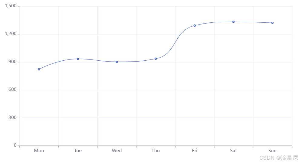
图表2:平滑折线图——数据趋势的流畅展示
平滑折线图通过曲线拟合数据点,使折线更加平滑流畅,适合展示趋势变化较为平缓的数据。这种图表能够减少数据波动带来的视觉干扰,更清晰地呈现数据的整体趋势。
import pyecharts.options as opts
from pyecharts.charts import Line
"""
Gallery 使用 pyecharts 1.1.0
参考地址: `https://echarts.apache.org/examples/editor.html?c=line-smooth`
目前无法实现的功能:
暂无
"""
x_data = ["Mon", "Tue", "Wed", "Thu", "Fri", "Sat", "Sun"]
y_data = [820, 932, 901, 934, 1290, 1330, 1320]
(
Line()
.set_global_opts(
tooltip_opts=opts.TooltipOpts(is_show=False),
xaxis_opts=opts.AxisOpts(type_="category"),
yaxis_opts=opts.AxisOpts(
type_="value",
axistick_opts=opts.AxisTickOpts(is_show=True),
splitline_opts=opts.SplitLineOpts(is_show=True),
),
)
.add_xaxis(xaxis_data=x_data)
.add_yaxis(
series_name="",
y_axis=y_data,
symbol="emptyCircle",
is_symbol_show=True,
is_smooth=True,
label_opts=opts.LabelOpts(is_show=False),
)
#.render("smoothed_line_chart.html")
.render_notebook()
)
代码解释:
- is_smooth=True 是实现平滑折线的关键参数,它会使折线图的线条变得平滑流畅
- symbol="emptyCircle" 设置标记点为空圆圈,增加图表的美观度
- is_symbol_show=True 显示标记点,帮助读者更清晰地识别数据点
- tooltip_opts=opts.TooltipOpts(is_show=False) 关闭提示框,简化图表
- splitline_opts=opts.SplitLineOpts(is_show=True) 显示分割线,提高数据的可读性
- label_opts=opts.LabelOpts(is_show=False) 关闭标签显示,避免图表过于拥挤
应用场景:
平滑折线图特别适合以下场景:
注意事项:
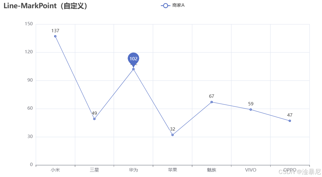
图表3:自定义标记点折线图——突出显示关键数据
自定义标记点折线图允许我们在图表中特定位置添加标记点,用于突出显示重要的数据点或事件。这种图表特别适合强调关键数据,使读者能够快速捕捉到重要信息。
import pyecharts.options as opts
from pyecharts.charts import Line
from pyecharts.faker import Faker
x, y = Faker.choose(), Faker.values()
c = (
Line()
.add_xaxis(x)
.add_yaxis(
"商家A",
y,
markpoint_opts=opts.MarkPointOpts(
data=[opts.MarkPointItem(name="自定义标记点", coord=[x[2], y[2]], value=y[2])]
),
)
.set_global_opts(title_opts=opts.TitleOpts(title="Line-MarkPoint(自定义)"))
#.render("line_markpoint_custom.html")
)
c.render_notebook()
代码解释:
- Faker.choose() 和 Faker.values() 用于生成测试数据
- markpoint_opts 参数用于配置标记点
- MarkPointItem 定义了一个标记点,其中:
- name 是标记点的名称
- coord 是标记点的坐标,这里使用了[x[2], y[2]]指定第三个数据点
- value 是标记点的值,这里使用了y[2]
- set_global_opts 设置了图表标题
应用场景:
自定义标记点折线图特别适合以下场景:
注意事项:
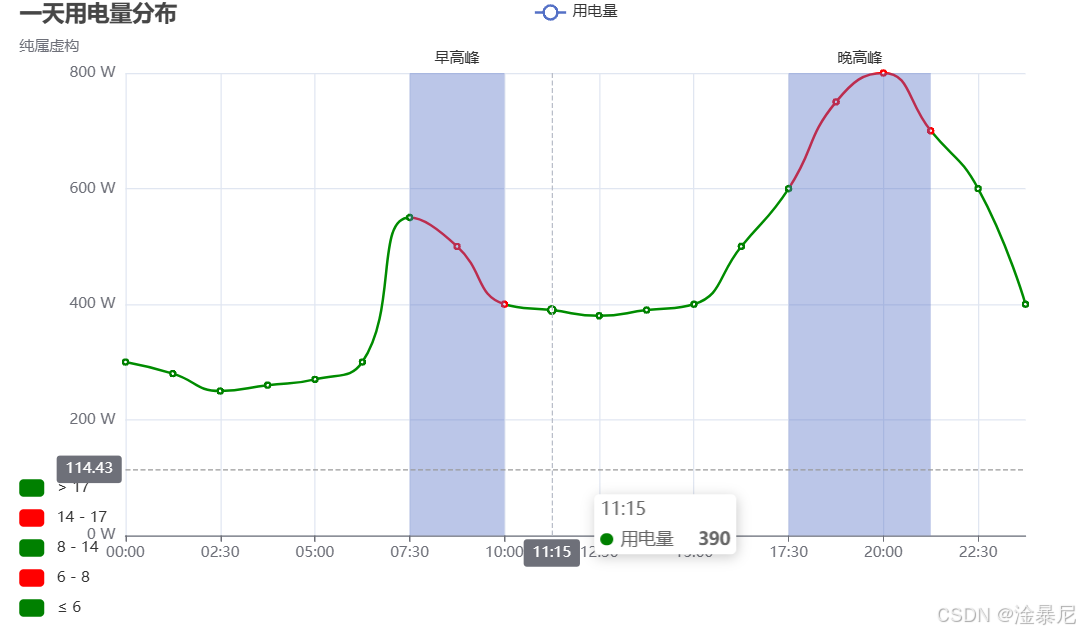
图表4:分段颜色折线图与峰值标记——用电量分布分析
分段颜色折线图通过不同颜色区分数据的不同阶段,结合标记区域可以更直观地展示数据的高峰期和低谷期。这种图表特别适合分析时间序列数据中的模式和异常情况。
import pyecharts.options as opts
from pyecharts.charts import Line
"""
Gallery 使用 pyecharts 1.1.0
参考地址: `https://echarts.apache.org/examples/editor.html?c=line-sections`
目前无法实现的功能:
1、visualMap 暂时无法设置隐藏
"""
x_data = [
"00:00",
"01:15",
"02:30",
"03:45",
"05:00",
"06:15",
"07:30",
"08:45",
"10:00",
"11:15",
"12:30",
"13:45",
"15:00",
"16:15",
"17:30",
"18:45",
"20:00",
"21:15",
"22:30",
"23:45",
]
y_data = [
300,
280,
250,
260,
270,
300,
550,
500,
400,
390,
380,
390,
400,
500,
600,
750,
800,
700,
600,
400,
]
(
Line()
.add_xaxis(xaxis_data=x_data)
.add_yaxis(
series_name="用电量",
y_axis=y_data,
is_smooth=True,
label_opts=opts.LabelOpts(is_show=False),
linestyle_opts=opts.LineStyleOpts(width=2),
)
.set_global_opts(
title_opts=opts.TitleOpts(title="一天用电量分布", subtitle="纯属虚构"),
tooltip_opts=opts.TooltipOpts(trigger="axis", axis_pointer_type="cross"),
xaxis_opts=opts.AxisOpts(boundary_gap=False),
yaxis_opts=opts.AxisOpts(
axislabel_opts=opts.LabelOpts(formatter="{value} W"),
splitline_opts=opts.SplitLineOpts(is_show=True),
),
visualmap_opts=opts.VisualMapOpts(
is_piecewise=True,
dimension=0,
pieces=[
{"lte": 6, "color": "green"},
{"gt": 6, "lte": 8, "color": "red"},
{"gt": 8, "lte": 14, "color": "green"},
{"gt": 14, "lte": 17, "color": "red"},
{"gt": 17, "color": "green"},
],
),
)
.set_series_opts(
markarea_opts=opts.MarkAreaOpts(
data=[
opts.MarkAreaItem(name="早高峰", x=("07:30", "10:00")),
opts.MarkAreaItem(name="晚高峰", x=("17:30", "21:15")),
]
)
)
#.render("distribution_of_electricity.html")
.render_notebook()
)
代码解释:
- is_smooth=True 设置折线为平滑曲线,使图表更加流畅美观
- visualmap_opts 配置了分段颜色映射,根据x轴索引值将折线分为不同颜色段:
- 索引≤6(对应00:00-07:30):绿色
- 6<索引≤8(对应08:45-10:00):红色(早高峰)
- 8<索引≤14(对应11:15-16:15):绿色
- 14<索引≤17(对应17:30-20:00):红色(晚高峰)
- 索引>17(对应21:15-23:45):绿色
- markarea_opts 标记了两个高峰期区域:
- 早高峰:07:30-10:00
- 晚高峰:17:30-21:15
- tooltip_opts 设置提示框触发方式为坐标轴,并将坐标轴指示器类型设置为十字交叉线
- boundary_gap=False 设置x轴不保留边距,使折线图更加紧凑
- splitline_opts=opts.SplitLineOpts(is_show=True) 显示y轴分割线,提高数据可读性
应用场景:
分段颜色折线图特别适合以下场景:
注意事项:
图表5:高级渐变背景折线图与Grid布局——专业数据展示
高级渐变背景折线图结合了Grid布局组件,可以更精确地控制图表在画布中的位置,同时通过精心设计的渐变色和标签样式,打造出专业级的数据可视化效果。这种图表特别适合用于企业报表、数据分析平台和专业演示。
import pyecharts.options as opts
from pyecharts.charts import Line, Grid
from pyecharts.commons.utils import JsCode
"""
参考地址: `https://gallery.echartsjs.com/editor.html?c=xEyDk1hwBx`
"""
x_data = ["14", "15", "16", "17", "18", "19", "20", "21", "22", "23"]
y_data = [393, 438, 485, 631, 689, 824, 987, 1000, 1100, 1200]
background_color_js = (
"new echarts.graphic.LinearGradient(0, 0, 0, 1, "
"[{offset: 0, color: '#c86589'}, {offset: 1, color: '#06a7ff'}], false)"
)
area_color_js = (
"new echarts.graphic.LinearGradient(0, 0, 0, 1, "
"[{offset: 0, color: '#eb64fb'}, {offset: 1, color: '#3fbbff0d'}], false)"
)
c = (
Line(init_opts=opts.InitOpts(bg_color=JsCode(background_color_js)))
.add_xaxis(xaxis_data=x_data)
.add_yaxis(
series_name="注册总量",
y_axis=y_data,
is_smooth=True,
is_symbol_show=True,
symbol="circle",
symbol_size=6,
linestyle_opts=opts.LineStyleOpts(color="#fff"),
label_opts=opts.LabelOpts(is_show=True, position="top", color="white"),
itemstyle_opts=opts.ItemStyleOpts(
color="red", border_color="#fff", border_width=3
),
tooltip_opts=opts.TooltipOpts(is_show=False),
areastyle_opts=opts.AreaStyleOpts(color=JsCode(area_color_js), opacity=1),
)
.set_global_opts(
title_opts=opts.TitleOpts(
title="OCTOBER 2015",
pos_bottom="5%",
pos_left="center",
title_textstyle_opts=opts.TextStyleOpts(color="#fff", font_size=16),
),
xaxis_opts=opts.AxisOpts(
type_="category",
boundary_gap=False,
axislabel_opts=opts.LabelOpts(margin=30, color="#ffffff63"),
axisline_opts=opts.AxisLineOpts(is_show=False),
axistick_opts=opts.AxisTickOpts(
is_show=True,
length=25,
linestyle_opts=opts.LineStyleOpts(color="#ffffff1f"),
),
splitline_opts=opts.SplitLineOpts(
is_show=True, linestyle_opts=opts.LineStyleOpts(color="#ffffff1f")
),
),
yaxis_opts=opts.AxisOpts(
type_="value",
position="right",
axislabel_opts=opts.LabelOpts(margin=20, color="#ffffff63"),
axisline_opts=opts.AxisLineOpts(
linestyle_opts=opts.LineStyleOpts(width=2, color="#fff")
),
axistick_opts=opts.AxisTickOpts(
is_show=True,
length=15,
linestyle_opts=opts.LineStyleOpts(color="#ffffff1f"),
),
splitline_opts=opts.SplitLineOpts(
is_show=True, linestyle_opts=opts.LineStyleOpts(color="#ffffff1f")
),
),
legend_opts=opts.LegendOpts(is_show=False),
)
)
(
Grid()
.add(
c,
grid_opts=opts.GridOpts(
pos_top="20%",
pos_left="10%",
pos_right="10%",
pos_bottom="15%",
is_contain_label=True,
),
)
#.render("beautiful_line_chart.html")
.render_notebook()
)
代码解释:
- 与图表1相比,本图表增加了Grid组件的使用,通过grid_opts精确控制图表在画布中的位置
- pos_top、pos_left、pos_right、pos_bottom参数设置图表与画布边缘的距离
- is_contain_label=True确保坐标轴标签被包含在Grid区域内,避免标签被截断
- 背景渐变色和区域填充渐变色使用JsCode定义,与图表1类似
- is_smooth=True设置平滑折线,symbol和symbol_size定义标记点样式
- label_opts设置数据标签显示在顶部,颜色为白色,提高可读性
- axisline_opts、axistick_opts和splitline_opts详细配置了坐标轴样式,营造出专业的视觉效果
应用场景:
高级渐变背景折线图特别适合以下场景:
注意事项:
总结
在本文中,我们详细介绍了五种高级折线图类型,从视觉效果到功能应用,全方位展示了pyecharts的强大 capabilities:
每种图表都有其独特的应用场景和注意事项,掌握这些技巧可以帮助您创建更加丰富、专业的数据可视化作品。
如果您想了解更多关于pyecharts的使用技巧,请关注我们的系列文章。感谢您的阅读!


评论前必须登录!
注册