 网硕互联帮助中心
伸缩盒模型的主轴对齐方式,侧轴对齐方式一行/多行,元素水平垂直居中,项目在主轴的基准长度等:
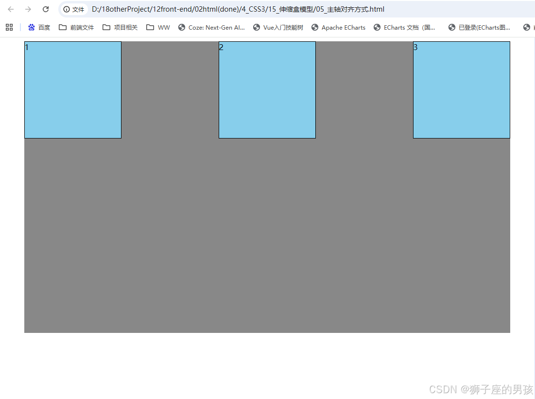
- Ⅰ、伸缩盒模型的主轴对齐方式:justify-content: flex-start/flex-end/center/space-around/space-between/space-evenly;
-
- 其一、代码为:
- 其二、结果为:
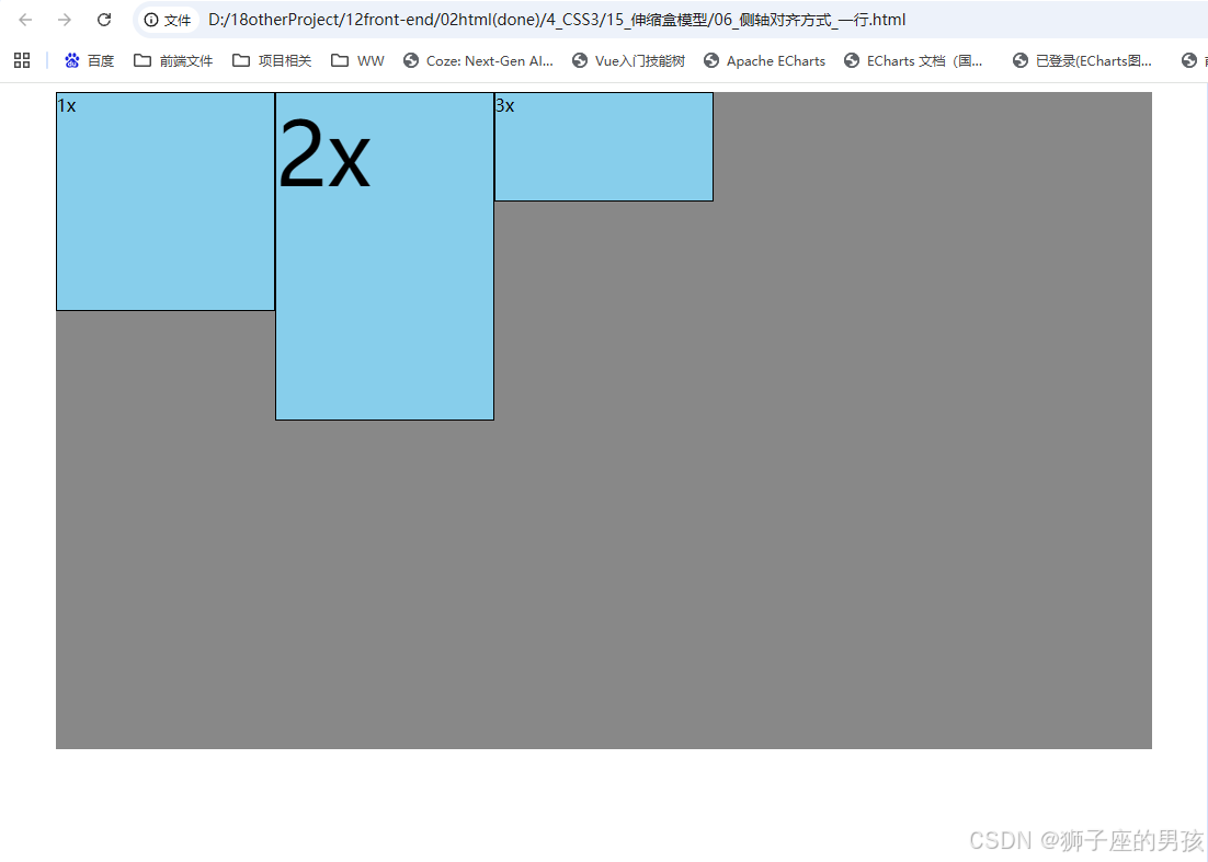
- Ⅱ、伸缩盒模型的侧轴对齐方式–一行:align-items: flex-start/flex-end/center/baseline/stretch;
-
- 其一、代码为:
- 其二、结果为:
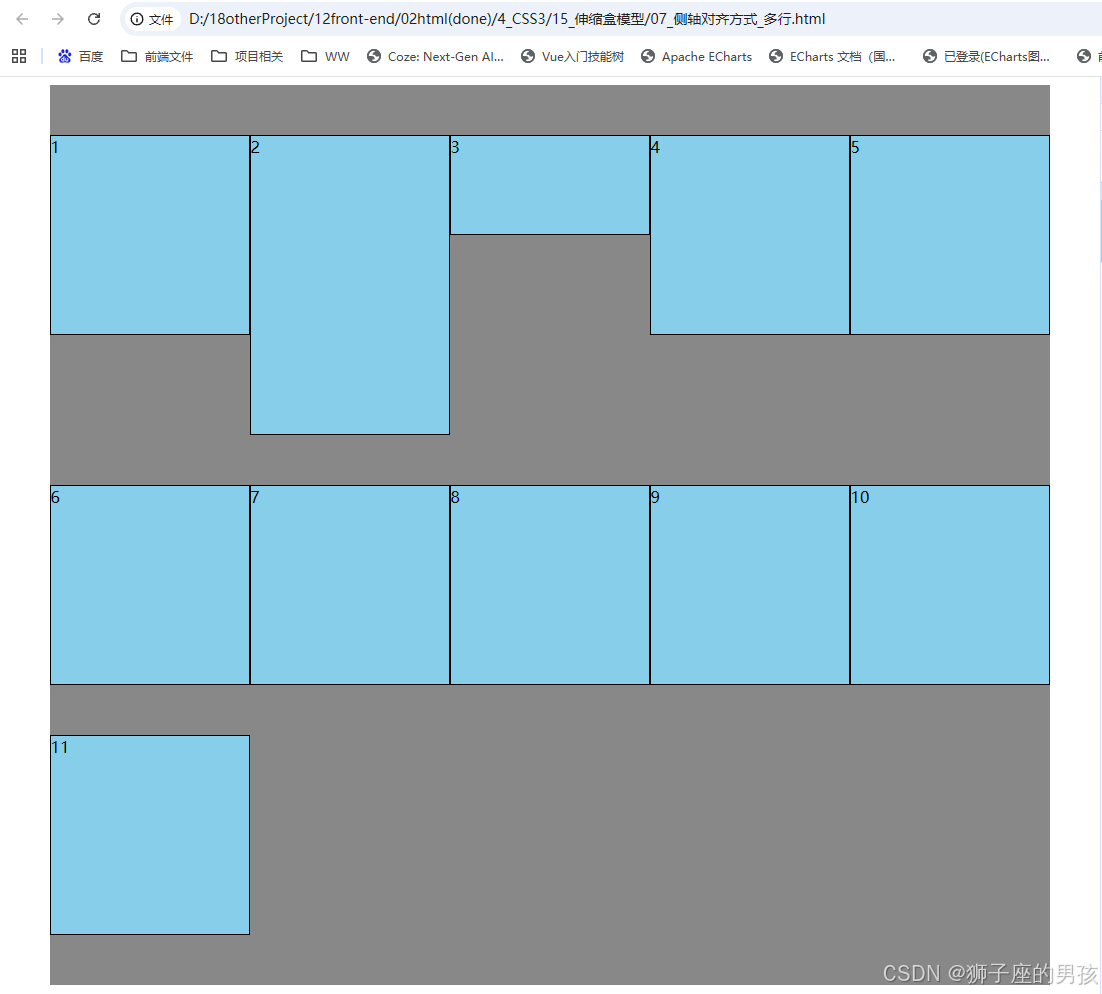
- Ⅲ、伸缩盒模型的侧轴对齐方式–多行:align-content: flex-start/flex-end/center/space-around/space-between/space-evenly/stretch;
-
- 其一、代码为:
- 其二、结果为:
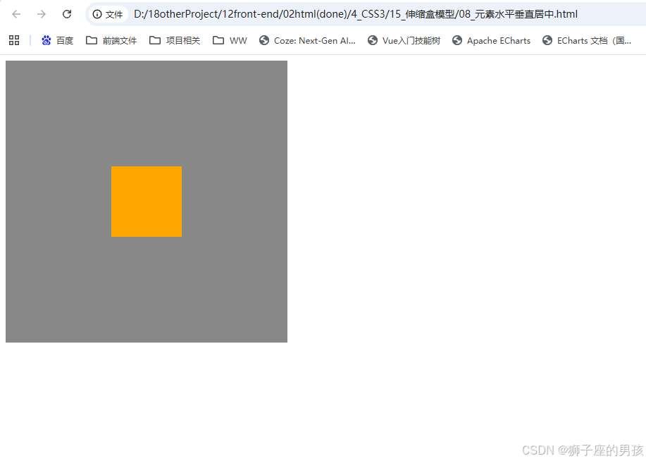
- Ⅳ、伸缩盒模型的元素水平垂直居中:justify-content: center;和align-items: center;
-
- 其一、代码为:
- 其二、结果为:
- Ⅴ、伸缩盒模型的项目在主轴的基准长度:flex-basis: 300px;
-
- 其一、代码为:
- 其二、结果为:
- Ⅵ、小结:
Ⅰ、伸缩盒模型的主轴对齐方式:justify-content: flex-start/flex-end/center/space-around/space-between/space-evenly;
其一、代码为:
<!DOCTYPE html>
<html lang="zh-CN">
<head>
<meta charset="UTF-8">
<title>05_主轴对齐方式</title>
<style>
.outer {
width: 1000px;
height: 600px;
background-color: #888;
margin: 0 auto;
/* 伸缩盒模型相关属性-start */
/* 将该元素变为了伸缩容器(开启了flex布局) */
display: flex;
/* 调整主轴方向,水平从左到右,默认 */
flex-direction: row;
/* 主轴换行方式,换行 */
flex-wrap: wrap;
/* 主轴的对齐方式,主轴的起始位置 */
/* justify-content: flex-start; */
/* 主轴的对齐方式,主轴的结束位置 */
/* justify-content: flex-end; */
/* 主轴的对齐方式,中间对齐 */
/* justify-content: center; */
/* 主轴的对齐方式,项目均匀的分布在一行中,项目与项目之间的距离,是项目距边缘的二倍 */
/* justify-content: space-around; */
/* 主轴的对齐方式,项目均匀的分布在一行中,项目与项目之间的距离是相等的,项目距边缘没有距离 */
justify-content: space-between;
/* 主轴的对齐方式,项目均匀的分布在一行中 */
/* justify-content: space-evenly; */
}
.inner {
width: 200px;
height: 200px;
background-color: skyblue;
border: 1px solid black;
box-sizing: border-box;
}
</style>
</head>
<body>
<div class="outer">
<div class="inner">1</div>
<div class="inner">2</div>
<div class="inner">3</div>
</div>
</body>
</html>
其二、结果为:
// 一进入页面后的页面:
Ⅱ、伸缩盒模型的侧轴对齐方式–一行:align-items: flex-start/flex-end/center/baseline/stretch;
其一、代码为:
<!DOCTYPE html>
<html lang="zh-CN">
<head>
<meta charset="UTF-8">
<title>06_侧轴对齐方式_一行</title>
<style>
.outer {
width: 1000px;
height: 600px;
background-color: #888;
margin: 0 auto;
/* 伸缩盒模型相关属性-start */
/* 将该元素变为了伸缩容器(开启了flex布局) */
display: flex;
/* 调整主轴方向,水平从左到右,默认 */
flex-direction: row;
/* 主轴换行方式,换行 */
flex-wrap: wrap;
/* 主轴的对齐方式,主轴的起始位置 */
justify-content: flex-start;
/* 侧轴的对齐方式,侧轴的起始位置对齐 */
align-items: flex-start;
/* 侧轴的对齐方式,侧轴的结束位置对齐 */
/* align-items: flex-end; */
/* 侧轴的对齐方式,侧轴的中间位置对齐 */
/* align-items: center; */
/* 侧轴的对齐方式,侧轴的中间位置对齐 */
/* 此时的 align-items: center; 与 align-items: baseline; 两个属性值都是中间位置对齐,但 center 对齐的是元素中心,baseline 对齐的是文字基线*/
/* align-items: baseline; */
/* 侧轴的对齐方式,拉伸到整个父容器(前提:伸缩项目不能给高度),默认 */
/* align-items: stretch; */
}
.inner {
width: 200px;
height: 200px;
background-color: skyblue;
border: 1px solid black;
box-sizing: border-box;
}
.inner2 {
height: 300px;
font-size: 80px;
}
.inner3 {
height: 100px;
}
</style>
</head>
<body>
<div class="outer">
<div class="inner">1x</div>
<div class="inner inner2">2x</div>
<div class="inner inner3">3x</div>
</div>
</body>
</html>
其二、结果为:
// 一进入页面后的页面:
Ⅲ、伸缩盒模型的侧轴对齐方式–多行:align-content: flex-start/flex-end/center/space-around/space-between/space-evenly/stretch;
其一、代码为:
<!DOCTYPE html>
<html lang="zh-CN">
<head>
<meta charset="UTF-8">
<title>07_侧轴对齐方式_多行</title>
<style>
.outer {
width: 1000px;
height: 900px;
background-color: #888;
margin: 0 auto;
/* 伸缩盒模型相关属性-start */
/* 将该元素变为了伸缩容器(开启了flex布局) */
display: flex;
/* 调整主轴方向,水平从左到右,默认 */
flex-direction: row;
/* 主轴换行方式,换行 */
flex-wrap: wrap;
/* 主轴的对齐方式,主轴的起始位置 */
justify-content: flex-start;
/* 侧轴的对齐方式(多行)侧轴的起始位置对齐 */
align-content: flex-start;
/* 侧轴的对齐方式(多行)侧轴的结束位置对齐 */
/* align-content: flex-end; */
/* 侧轴的对齐方式(多行)侧轴的中间位置对齐 */
/* align-content: center; */
/* 侧轴的对齐方式(多行),伸缩项目之间的距离是相等的,且是边缘距离的2倍 */
/* align-content:space-around; */
/* 侧轴的对齐方式(多行),伸缩项目之间的距离是相等的,且边缘没有距离 */
/* align-content:space-between; */
/* 侧轴的对齐方式(多行),伸缩项目之间的距离是相等的 */
align-content:space-evenly;
/* 侧轴的对齐方式(多行),拉伸,默认 */
/* align-content: stretch; */
}
.inner {
width: 200px;
height: 200px;
background-color: skyblue;
border: 1px solid black;
box-sizing: border-box;
}
.inner2 {
height: 300px;
}
.inner3 {
height: 100px;
}
</style>
</head>
<body>
<div class="outer">
<div class="inner">1</div>
<div class="inner inner2">2</div>
<div class="inner inner3">3</div>
<div class="inner">4</div>
<div class="inner">5</div>
<div class="inner">6</div>
<div class="inner">7</div>
<div class="inner">8</div>
<div class="inner">9</div>
<div class="inner">10</div>
<div class="inner">11</div>
</div>
</body>
</html>
其二、结果为:
// 一进入页面后的页面:
Ⅳ、伸缩盒模型的元素水平垂直居中:justify-content: center;和align-items: center;
其一、代码为:
<!DOCTYPE html>
<html lang="zh-CN">
<head>
<meta charset="UTF-8">
<title>08_元素水平垂直居中</title>
<style>
.outer {
width: 400px;
height: 400px;
background-color: #888;
display: flex;
/* 方案一 */
/* justify-content: center; */
/* align-items: center; */
}
.inner {
width: 100px;
height: 100px;
background-color: orange;
/* 方案二 */
margin: auto;
}
</style>
</head>
<body>
<div class="outer">
<div class="inner"></div>
</div>
</body>
</html>
其二、结果为:
// 一进入页面后的页面:
Ⅴ、伸缩盒模型的项目在主轴的基准长度:flex-basis: 300px;
其一、代码为:
<!DOCTYPE html>
<html lang="zh-CN">
<head>
<meta charset="UTF-8">
<title>09_项目在主轴的基准长度</title>
<style>
.outer {
width: 1000px;
height: 900px;
background-color: #888;
margin: 0 auto;
/* 伸缩盒模型相关属性-start */
/* 将该元素变为了伸缩容器(开启了flex布局) */
display: flex;
/* 调整主轴方向,水平从左到右,默认 */
flex-direction: row;
/* 主轴换行方式,换行 */
flex-wrap: wrap;
/* 主轴的对齐方式,主轴的起始位置 */
justify-content: flex-start;
}
.inner {
width: 200px;
height: 200px;
background-color: skyblue;
border: 1px solid black;
box-sizing: border-box;
}
.inner2 {
/* 设置伸缩项目在主轴上的基准长度,若主轴是横向的则宽度失效,若主轴是纵向的则高度失效 */
/* 此时的 flex-basis 属性生效,该属性值表示基准长度 */
flex-basis: 300px;
}
</style>
</head>
<body>
<div class="outer">
<div class="inner">1</div>
<div class="inner inner2">2</div>
<div class="inner">3</div>
</div>
</body>
</html>
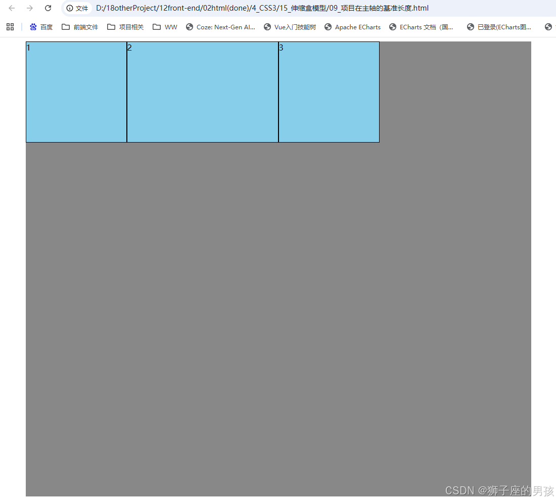
其二、结果为:
// 一进入页面后的页面:
Ⅵ、小结:
其一、哪里有不对或不合适的地方,还请大佬们多多指点和交流! 其二、若有转发或引用本文章内容,请注明本博客地址(直接点击下面 url 跳转) https://blog.csdn.net/weixin_43405300,创作不易,且行且珍惜! 其三、有兴趣的话,可以多多关注这个专栏(Vue(Vue2+Vue3)面试必备专栏)(直接点击下面 url 跳转):https://blog.csdn.net/weixin_43405300/category_11525646.html?spm=1001.2014.3001.5482 **其四、再有兴趣的话,也可以多多关注这个专栏(Java)(直接点击下面 url 跳转):[https://blog.csdn.net/weixin_43405300/category_12654744.html?spm=1001.2014.3001.5482](https://blog.csdn.net/weixin_43405300/category_12654744.htm









评论前必须登录!
注册