 网硕互联帮助中心
第19章:ECharts 折线图 + 标记点、标记线,自定义 tooltip
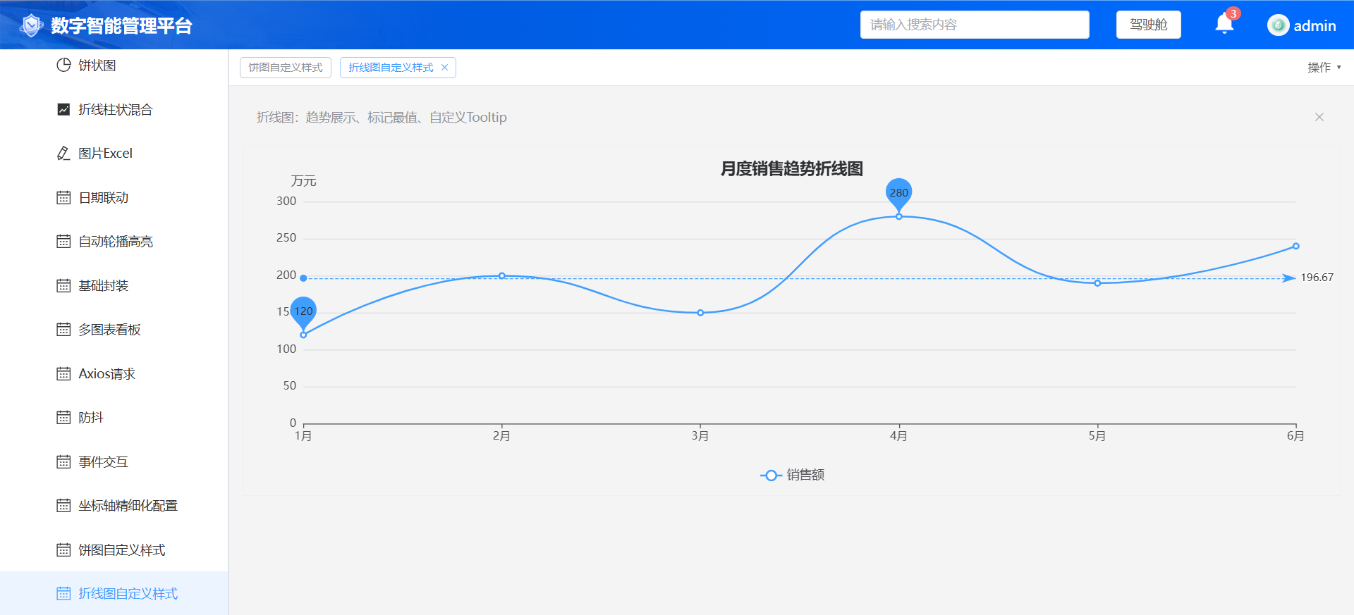
业务场景:趋势分析折线图,常用于展示流量、销售额随时间变化。本节学习标记最大值最小值、基准线,自定义提示框内容,保留之前封装的点击事件、防抖 resize,echartHelper.js 无需修改。
页面完整 Vue 代码
<template>
<div class="chart-container">
<el-alert title="折线图:趋势展示、标记最值、自定义Tooltip" type="info" style="margin-bottom:10px"/>
<div
ref="chartRef"
style="width:100%;height:400px;border:1px solid #eee"
></div>
<el-dialog v-model="dialogVisible" title="折线图点击详情">
<p>时间:{{ clickData.name }}</p>
<p>销售额:{{ clickData.value }}</p>
</el-dialog>
</div>
</template>
<script setup>
import { ref } from 'vue'
import { useEcharts } from '@/composables/echartHelper'
const { chartRef, setChartOption, onChartEvent } = useEcharts()
const dialogVisible = ref(false)
const clickData = ref({ name:'', value:0 })
const option = {
title: {
text: '月度销售趋势折线图',
left: 'center',
textStyle: {
fontSize:18,
color:'#303133'
}
},
tooltip: {
trigger: 'axis',
// 自定义提示框文字
formatter: function(params) {
return `${params[0].name}<br/>销售额:${params[0].value} 万元`
}
},
legend: {
data: ['销售额'],
bottom: 10,
textStyle: { fontSize:14 }
},
grid: {
left: '3%',
right: '4%',
bottom: '15%',
containLabel: true
},
xAxis: {
type: 'category',
boundaryGap: false,
data: ['1月','2月','3月','4月','5月','6月'],
axisLabel: { fontSize:13 }
},
yAxis: {
type: 'value',
name: '万元',
nameTextStyle: { fontSize:14 },
axisLabel: { fontSize:13 }
},
series: [
{
name: '销售额',
type: 'line',
data: [120, 200, 150, 280, 190, 240],
smooth: true, // 平滑曲线
itemStyle: { color: '#409EFF' },
// 标记最大值、最小值
markPoint: {
data: [
{ type: 'max', name: '最大值' },
{ type: 'min', name: '最小值' }
]
},
// 基准横线
markLine: {
data: [
{ type: 'average', name: '平均值' }
]
}
}
]
}
setChartOption(option)
// 折线图点击事件
onChartEvent('click', (params)=>{
console.log('折线点击参数', params)
clickData.value = {
name: params.name,
value: params.value
}
dialogVisible.value = true
})
</script>
✅ 测试步骤
拓展知识点:
设置smooth: false 就变成折线尖角样式;series 里面增加新对象,就可以做多条折线对比。






评论前必须登录!
注册